Page Builder > extensions
Customize Editors
Learn how to customize page builder editors
This feature is available since Webiny v5.40.0.
- how editors work
- how to add/remove/replace existing elements
- how to customize element layouts
Overview
Webiny Page Builder app provides different editors for various purposes. There’s a Block Editor to build reusable content blocks, a Template Editor to build page templates, and a Page Editor to build pages using templates, blocks, or fully from scratch. These editors share the same underlying framework, which makes them customizable.
 Page Editor
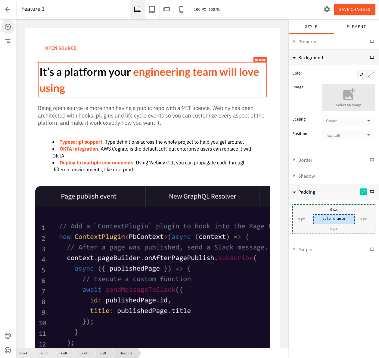 Block Editor
Base Editor
All editors share the same base editor, with the core mechanics, plugins, and UI elements already in place. Individual editor configs add the specifics: variations of elements, settings, behavior.
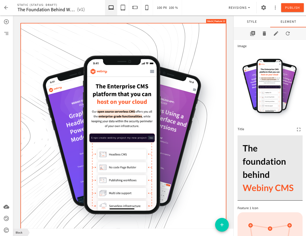
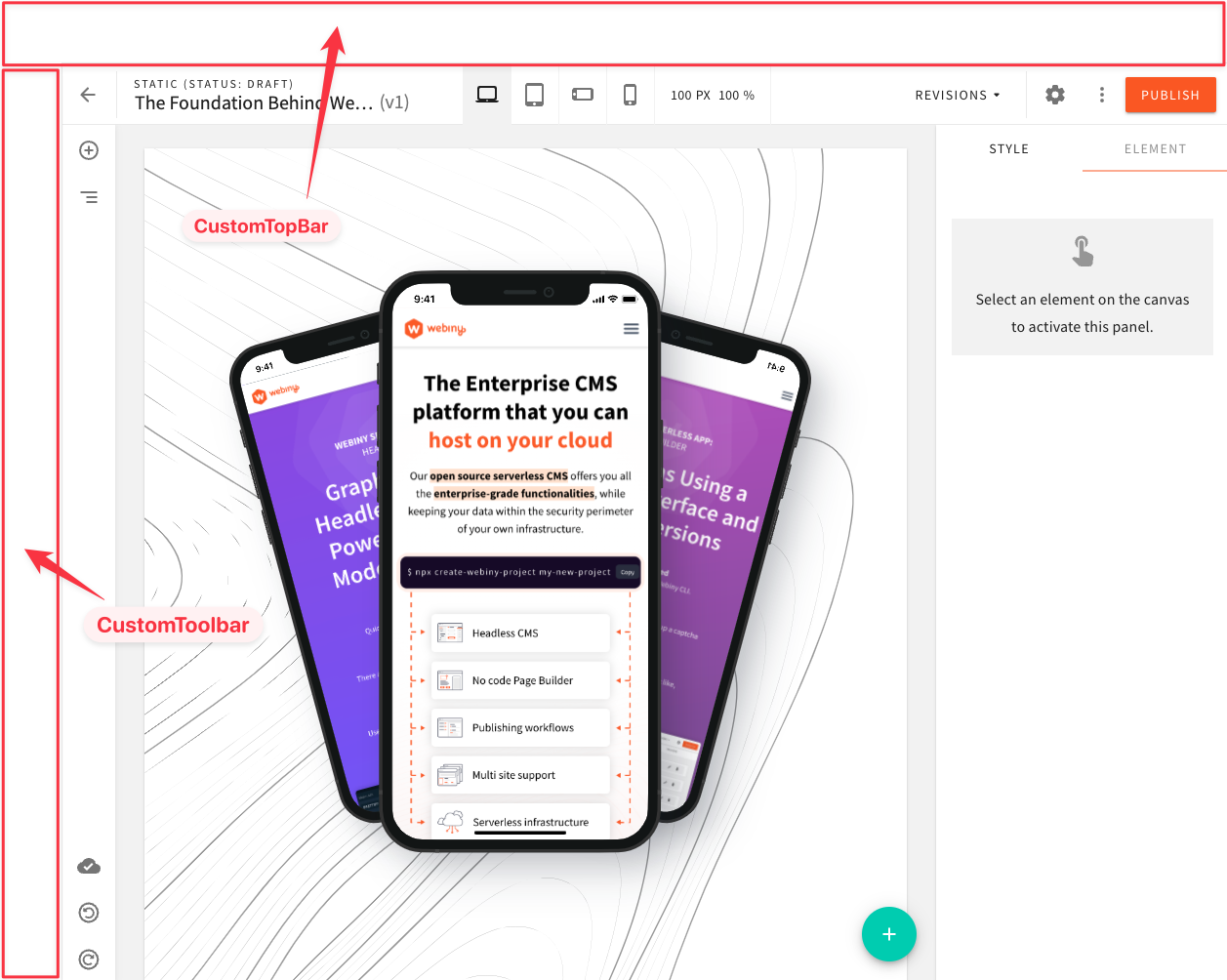
Out of the box, the base editor has 4 top-level UI elements: TopBar, Toolbar, Content, and Sidebar. Furthermore, within these top-level elements, there are groups of child elements, which allow you to target specific positions when adding new elements. For example, the display mode selector (laptop, tablet, mobile) you see on the image below, belongs to the center group of the TopBar element. We’ll cover each top-level element in depth, in the following sections.
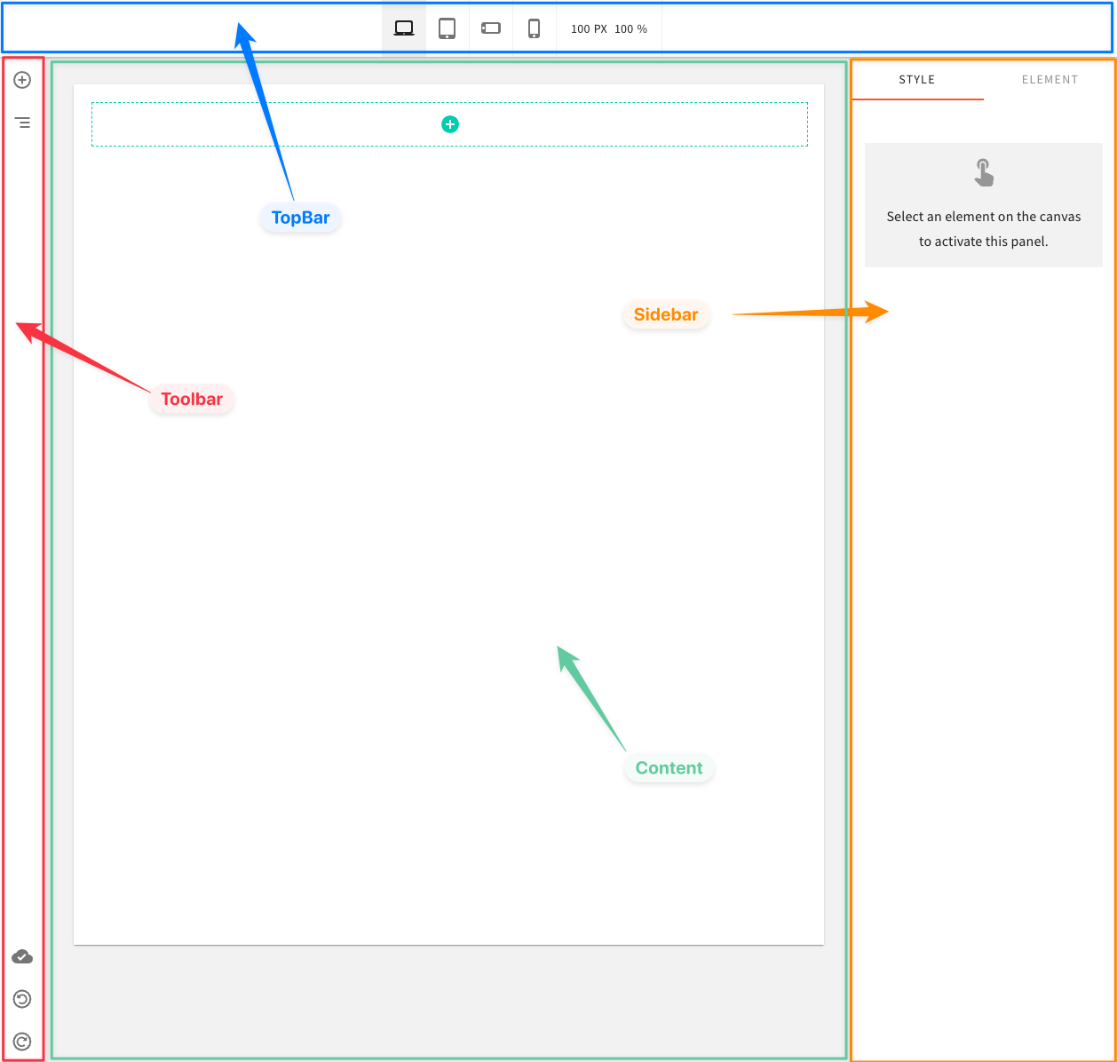 Base Editor
Using the Code Examples
The following code examples follow our usual configuration pattern. You need to add the code from
the examples to your apps/admin/src/App.tsx. Here’s an example:
In the following sections, we’ll only be showing the code that is related to the configuration itself. The rest of the code shown above will be omitted.
Discover UI Elements
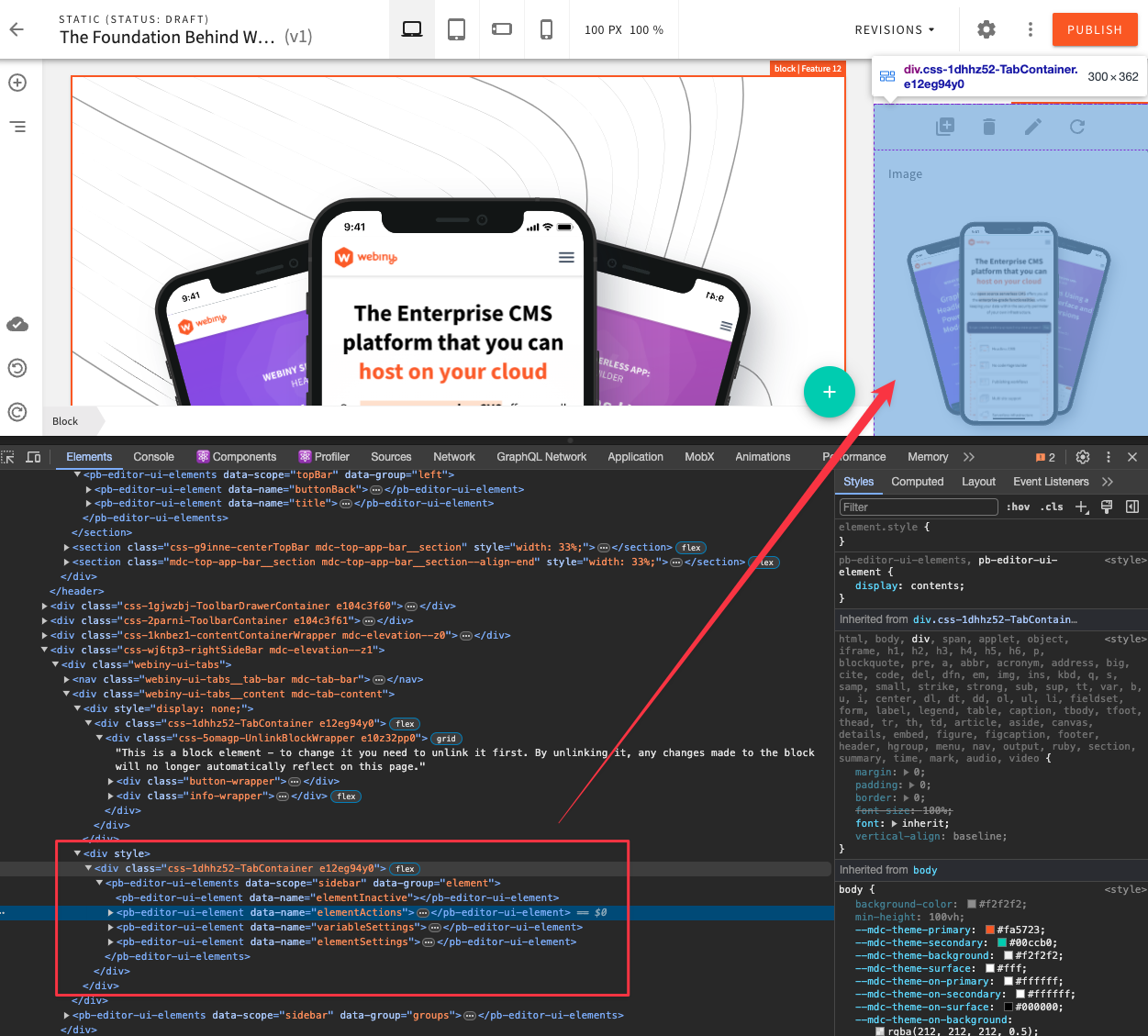
In the code examples, we’ll be referring to existing elements by their name. The most reliable way of discovering the element names and groups is by using your browser’s developer tools, and simply inspecting the element you’re interested in. Element groups are enclosed with a pb-editor-ui-elements DOM element, and individual elements with a pb-editor-ui-element DOM element. On these DOM elements, you’ll be able to find the data-group and data-name attributes. That’s what you’re looking for.
 Discover Elements via Developer Tools
Choosing an Editor to Customize
When you want to customize an editor, first you need to know which editor you want to customize, as customizations are scoped to a specific editor. Once you know what editor you want to target, use the right config component:
In this article, we will focus on the Page Editor, as it’s usually the main editor developers want to customize. However, all the techniques and patterns shown the examples below apply to all editors.
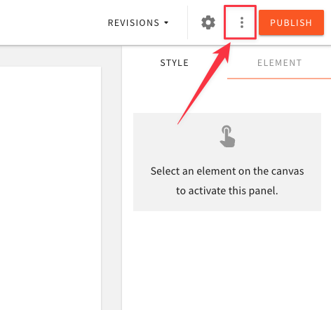
TopBar
The top-level TopBar element has 3 element groups: left, center, and actions.
Add an Element
To add a new element, use the Ui.TopBar.Element config component, give it a name, a group it belongs to, and an element, which is a React element.
Position an Element
To position a element before or after another element, use the before or after props to specify the name of the existing element.
Remove an Element
To remove an existing element, reference it by name, and add a remove prop.
Replace an Element
To replace an existing element, reference the existing element by name, and specify a different element prop.
Actions
The actions element group is one of the most commonly customized, so we provided several higher level components to make adding actions even easier, comparing to other generic elements.
Note that all the same props are supported on the TopBar.Action config component: before,
after, and remove.
Dropdown Actions
For actions that you don’t use often, or don’t need to be visible in the TopBar, you can use the built-in DropdownActions menu.
 Secondary Actions
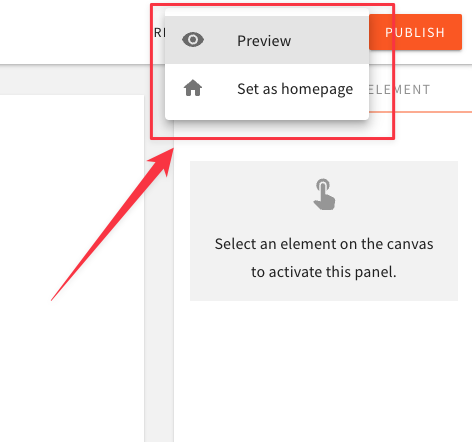 Secondary Actions Menu
To register a dropdown menu action, use the TopBar.DropdownAction config component. We also provide a TopBar.DropdownAction.MenuItem component to render the actual menu item.
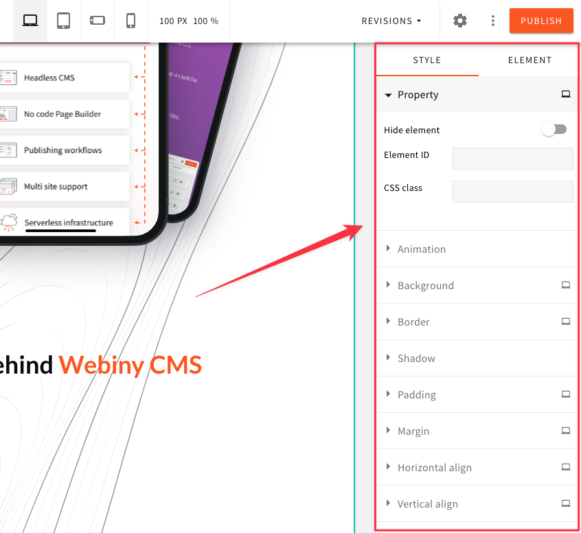
Element Properties
Every content element, like paragraph, heading, image, button, etc., has its own set of properties that can be tweaked by the content creators. These properties are rendered within the top-level Sidebar element, and are grouped into style and element groups, represented by Style and Element tabs, respectively.
 Element Properties
The plugins used to register these properties are pb-editor-page-element-style-settings for the style group, and pb-editor-page-element-advanced-settings for the element group.
To see the implementation of the built-in element property plugins, please refer to our Github .
.
Add a Property
To add a new property, use the ElementProperty config component, give it a name, a group (use the constants defined on the ElementProperty component), and an element to render the property UI.
Remove a Property
To remove an element property, use the ElementProperty config component, and add a remove prop.
Update an Element
To update an element via your custom element properties, use the useUpdateElement hook. In this example,
The result of this little plugin is shown in the video:
 Custom Property to Update Button Text
Editor Layout
The editor, and the top-level elements, each have their own Layout component, which controls how that particular element is rendered. This means that you can change every element individually, but also change the entire editor layout.
Editor styles, element positioning, scrollable panels, drag&drop behavior, a lot of it depends
on various CSS positioning techniques and tricks. The top-level elements are mostly position: fixed, and will require some fiddling with CSS.
For reference, here are some links to Github, where each of the Layout component implementation can be found:
Add a Custom Editor Frame
This example demonstrates how you can decorate the default editor layout and add custom panels. We’ll add a new panel above the default TopBar element, and also a new toolbar to the left of the existing Toolbar element.
Enable this editor configuration in the apps/admin/src/App.tsx as described in the Using the Code Examples section. Simply mount your <EditorLayout /> as a child of <PageEditorConfig>:
The result will look like this:
 Custom Editor Frame
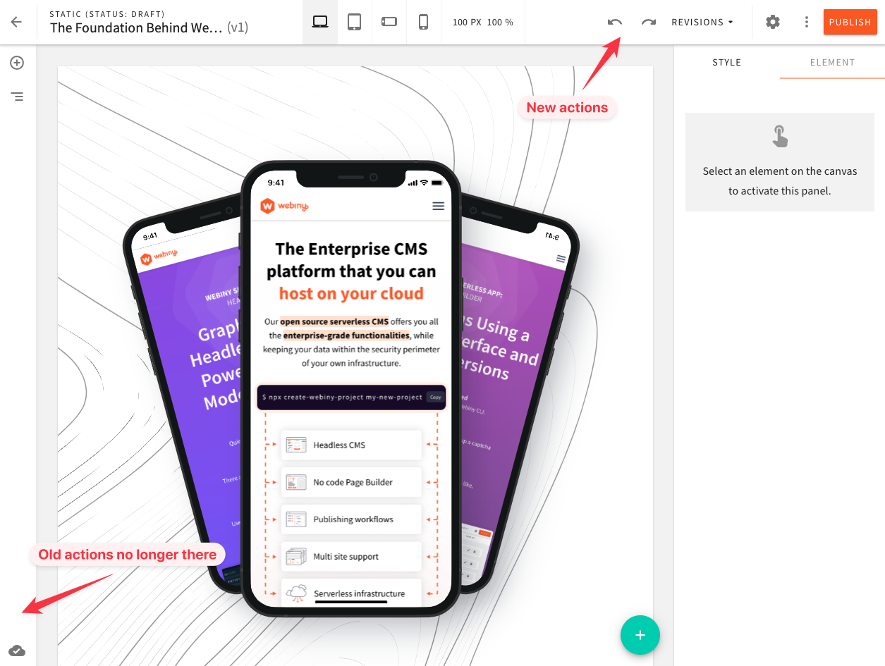
Move Undo/Redo Buttons to the TopBar
By default, Undo and Redo actions are displayed in the Toolbar element, with the action tooltip opening to the right. Simply moving them to the TopBar will not change the direction of the tooltip. So in this next code example, we’ll demonstrate how you can reimplement these buttons yourself, position them in the TopBar, and remove the default ones from the Toolbar.
And again, enable this configuration, just like you did in the previous section:
The result of this configuration will look like this:
 Move Undo/Redo Buttons to TopBar
Customize the Sidebar
Out of the box, Webiny provides config components to add the most common things to the Sidebar, like element actions, and element properties. The default Sidebar is organized into two main groups: style and element, which group related element properties together. These groups are rendered using regular tabs.
However, you might want to completely change how the Sidebar is rendered. This section demonstrates how you can easily move things around, change the Sidebar layout, add custom groups, etc.
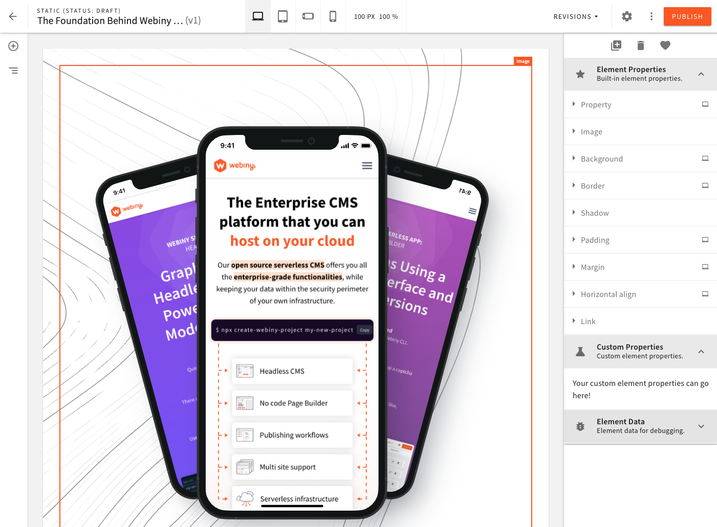
In this example we will:
- change the
Sidebarlayout from tabs to accordion - render the
styleandelementproperties in one group, called “Element Properties” - add a new group for custom properties, or any other functionality you want to add, called “Custom Properties”
- move the element actions from their default position in the “Element” tab, to the top of the
Sidebar - remove the default “Click to Activate” widget, which is usually visible when no element is activated in the editor
- add an “Element Data” accordion, only visible in development mode (while developing on localhost)
And again, enable the configuration:
The result of this configuration will look like this:
 Custom Sidebar